The colors behind my latest printable tags – Lately, I’ve been spending a lot of time creating new printables with little farmhouse scenes with barns, sheep, rolling hills, and timeworn textures. As I was working on this latest set, I started to notice something I tend to do without even thinking…
Again and again, I keep coming back to the same colors. Just soft and aged, familiar tones, the kind that feel like they’ve been around for years. So today I wanted to share the color palette behind these designs, and why these shades continue to find their way into my work again and again.
— ✧ —— ✧ —— ✧ —— ✧ —— ✧ —— ✧ —— ✧ —— ✧ —
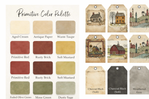
→ The Palette Behind These Tags
Right away, you’ll notice there is nothing too bold or overpowering. Everything is softened just a bit, like it’s been gently worn over time. Warm, Aged Neutrals
Here are the foundations of almost every piece I create.
- Aged cream
- Antique paper
- Warm taupe
Because of this, these tones give that “old paper” look, the kind that instantly makes something feel vintage and handmade. They’re what helps everything else sit nicely together without feeling too sharp or modern.
— ✧ —— ✧ —— ✧ —— ✧ —— ✧ —— ✧ —— ✧ —— ✧ —
→ Soft Primitive Reds & Mustards
If there’s one color family that defines primitive style, it’s this one.
- Primitive red
- Rusty brick
- Soft mustard
For example, you’ll see these in the barns, houses, and little details throughout the tags. They add warmth and character without feeling too bright. They bring that cozy, lived-in feel I’m always drawn to.
— ✧ —— ✧ —— ✧ —— ✧ —— ✧ —— ✧ —— ✧ —— ✧ —
→ Earthy Greens & Rolling Hills
These might be my favorite part of this set.
- Faded olive
- Moss green
- Dusty sage
Because of that, this color group creates those soft, patchwork-style landscapes in the background, the rolling hills and quiet countryside feel. They ground everything and make the designs feel calm and natural.
— ✧ —— ✧ —— ✧ —— ✧ —— ✧ —— ✧ —— ✧ —— ✧ —
→ Soft Contrast & Weathered Texture
Instead of using harsh black, I tend to soften everything just a bit.
- Charcoal black (softened)
- Weathered gray
At the same time, these are the colors that add detail, roof lines, outlines, tiny accents – without overpowering the rest of the design.
— ✧ —— ✧ —— ✧ —— ✧ —— ✧ —— ✧ —— ✧ —— ✧ —
→ Why These Colors Work So Well Together
What I love most about this palette is that nothing is trying too hard. Instead, everything feels:
- slightly faded
- gently worn
- naturally balanced
And that’s really what primitive style is all about. It’s not perfect. It’s not polished. It’s comfortable.
— ✧ —— ✧ —— ✧ —— ✧ —— ✧ —— ✧ —— ✧ —— ✧ —
→ How This Shows Up in My Designs
In this tag set, these colors come together in simple little scenes. For example:
- barns and saltbox houses
- sheep in quiet fields
- layered hills with soft patterns
- aged paper textures and stitched details
Each piece is simple on its own, but together they tell a soft, nostalgic story.
— ✧ —— ✧ —— ✧ —— ✧ —— ✧ —— ✧ —— ✧ —— ✧ —
→ A Little Creative Note
I didn’t sit down and plan this palette ahead of time. Instead, it just… happened. And over time, I’ve learned that when certain colors keep showing up like that, it usually means you’ve found something that feels like you.
In my last post, I shared more about why I love primitive printables and how I use them in my own projects. If you missed it, you can read it here → Why I Love Primitive Printables
Happy Crafting!
Nancie
SCC Digital Designs – All of our designs on our website
SCC Digital Designs on Etsy – Clipart , Stickers, SVGs & laser files
Scrappy Clipart – Clipart & stickers on Etsy
SCC Printables Studio – Printables & planners on Etsy